I have tested some sample colours of both procion and acid dyes on silk to achieve colours similar to a palette I have chosen to design with. I have found that the acid dyes did give a brighter colour, however, I found the procion dyes blended and dissolved together a lot easier and were also closer to my colour palette tones.
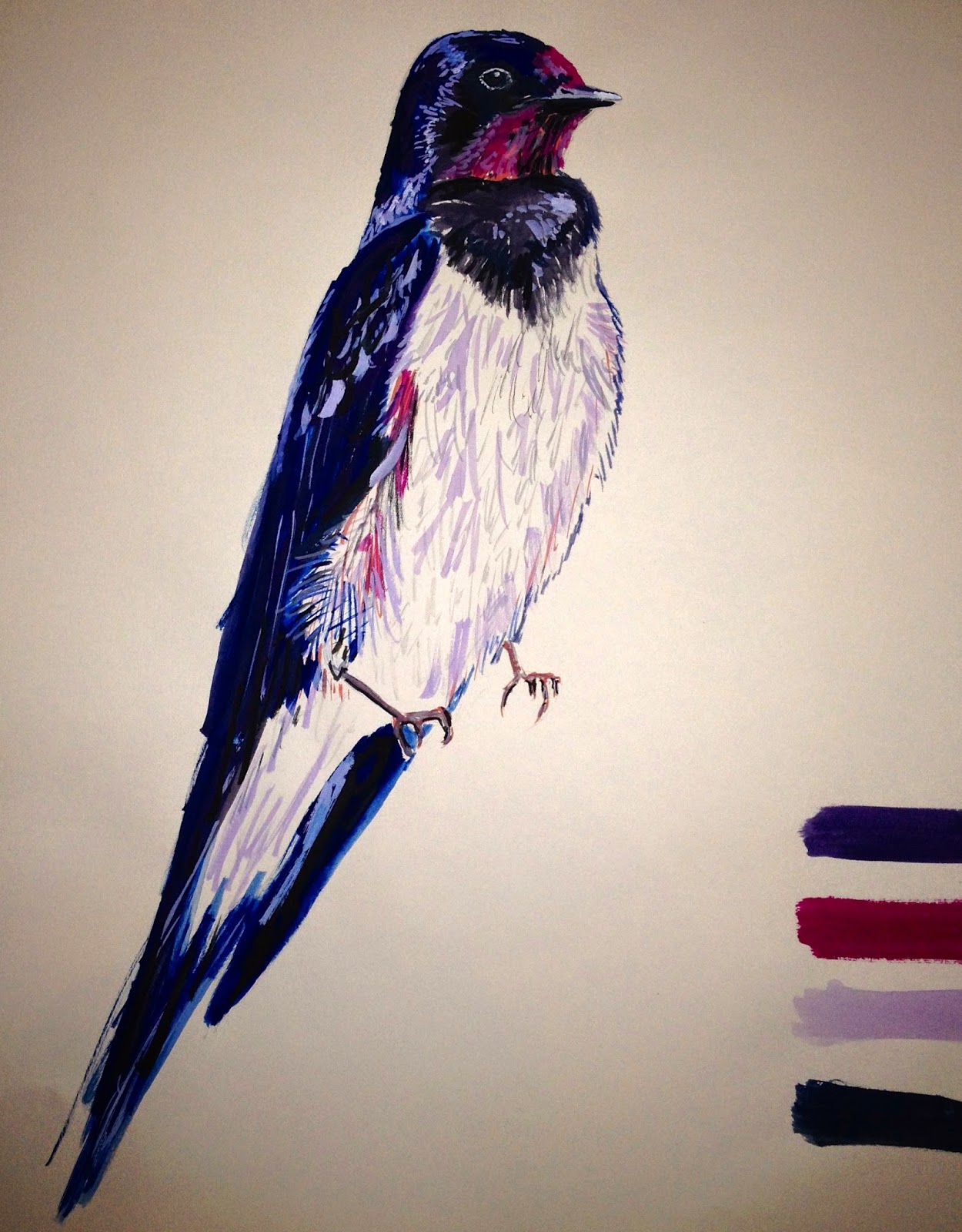
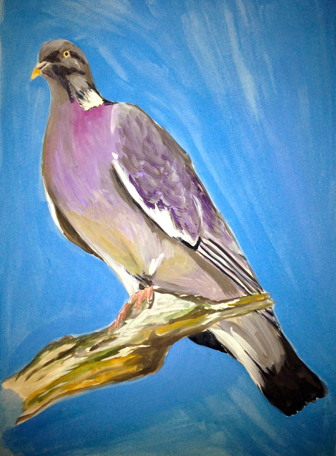
Here you can see how I have begun drawing British birds with watercolour pencils and gouash. I really like the thick quality to the gouash as it gives a really strong colour, however, I am also pleased with how the watercolour pencils allow detail and can be blended for various tone. I believe the drawings with a coloured background gives a bolder appearance and I have also started to think about pattern by repeating birds near one another with branch-like lines and patterns which I have created from looking at the birds feathers.
These are my favourite designs for scarves where I have incorporated lino cuttings with photoshop-editing to achieve brightly coloured prints which subtly show the anatomical theme in a light-hearted and more commercial way which I find more appealing to a wider audience.
Here I have scanned plastic faux bones and edited using photoshop to create colourful designs for a scarf context. I really like the colour palettes of these ideas and believe they would be successful as digital prints on a silk satin. I have also added my own drawings to add some extra interest with pattern and line.
These images are simply photographs of meat which I have edited on photoshop. Although the theme is slightly gruesome, and not something that you would imagine as being appealing or suited on fashion garments, I feel that when the colours are edited so they appear less "bloody" they have a peaceful, futuristic and marbled look which is quite intriguing.
I have also mirror-repeated one image because it gives a symmetrical appearance which makes it feel modern and would suit a scarf context.
These are my initial prints where I have explored using lino cutting to create a structured feeling pattern which shows my theme of skeletal forms. I am very happy with these first prints and so I will next develop them further with more variety of shapes and colours. I will also try layering up different prints to create a deeper, more exciting print.
I have looked at particular awe-inspiring lino prints and taken notes from the following videos which show clearly the best ways to achieve a successful print.
James Green produces clean, crisp lino prints with character. A video below shows an interview with him where he explains his view on creating a print as well as some of his work.
Gary Ratushniak creates very bold, outstanding prints with movement and a three-dimensional quality.
He uses strong colours which I am very drawn to and a composition which pulls your attention into the piece. This video explains his own influences of his work.
Thomas Shahan creates very detailed prints with one print, rather than layers of different colours like James green or Gary Ratushniak. Shahan's influences date back to very early prints with elements of surrealism.
During my last project I began exploring printing with lino cuttings which I believe where successful through their hand-crafted appearance. I am therefore planning to take this method further into my next project, where I will focus on skeletal forms.
Here i have scanned in leaves to create interesting compositions which i have enhanced using photoshop. I really like the vivid colours and intriguing appearance of the leaves layered together and the relation to victorian botanical interest.
To create an interesting and exciting pattern, i imitated the textures or still life objects such as string, a faux christmas tree and a woven rug using drawing and then cut out bottle shapes from the texture-filled paper.
I cut up this piece again into circles and re-applied to paper. I really like the colourful, unpredicted outcome and it's slight random, energetic appeal.
I progressed this technique further onto photoshop where i could use mark-making lines and then cut out butterfly shapes in a similar way. I have found both very effective in creating a quick interesting pattern. For myself, i believe the hand-drawn and cut has potential for a three-dimensional and organic effect, although I find the computer design has a sophisticated finish.