Sunday, 11 January 2015

Colour palette

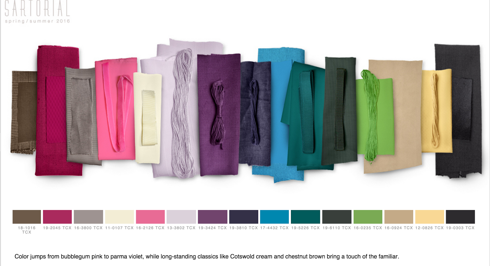
Aiming my scarf designs for spring/summer 2016, I haven chosen a colour palette I am really appealed by because it reminds me of bright, fresh and stylish 1960's colours.


I also want to put a modern twist on the British Union Jack colours; red, white and blue because they have an obvious relation to Britain, a theme I am looking into for my research report. To do this I will use the above colour palettes as well as possible grey tones to make it a less obvious and cliche red, white and blue. 

Wednesday, 7 January 2015

MADE IN BRITAIN!

Researching for my dissertation; "does the Made in Britain label add value to a textiles product?" I was lucky enough to tour the David Nieper factory in Derbyshire. It was amazing to see the garments made, from start to finish, all in one building. From the design, pattern cutting, stitching, examining, finishing and then selling in their factory shop. The garments are undeniably of the highest quality and hearing that many customers return to repair garments which are many years old, they stand the test of time.
The images below show my tour of the factory


Thursday, 16 October 2014

print dyes colour testing

I have tested some sample colours of both procion and acid dyes on silk to achieve colours similar to a palette I have chosen to design with. I have found that the acid dyes did give a brighter colour, however, I found the procion dyes blended and dissolved together a lot easier and were also closer to my colour palette tones.
 Acid dyes.
 Procion Dyes.

 Colour Palette.

Sunday, 12 October 2014

Drawings Birds


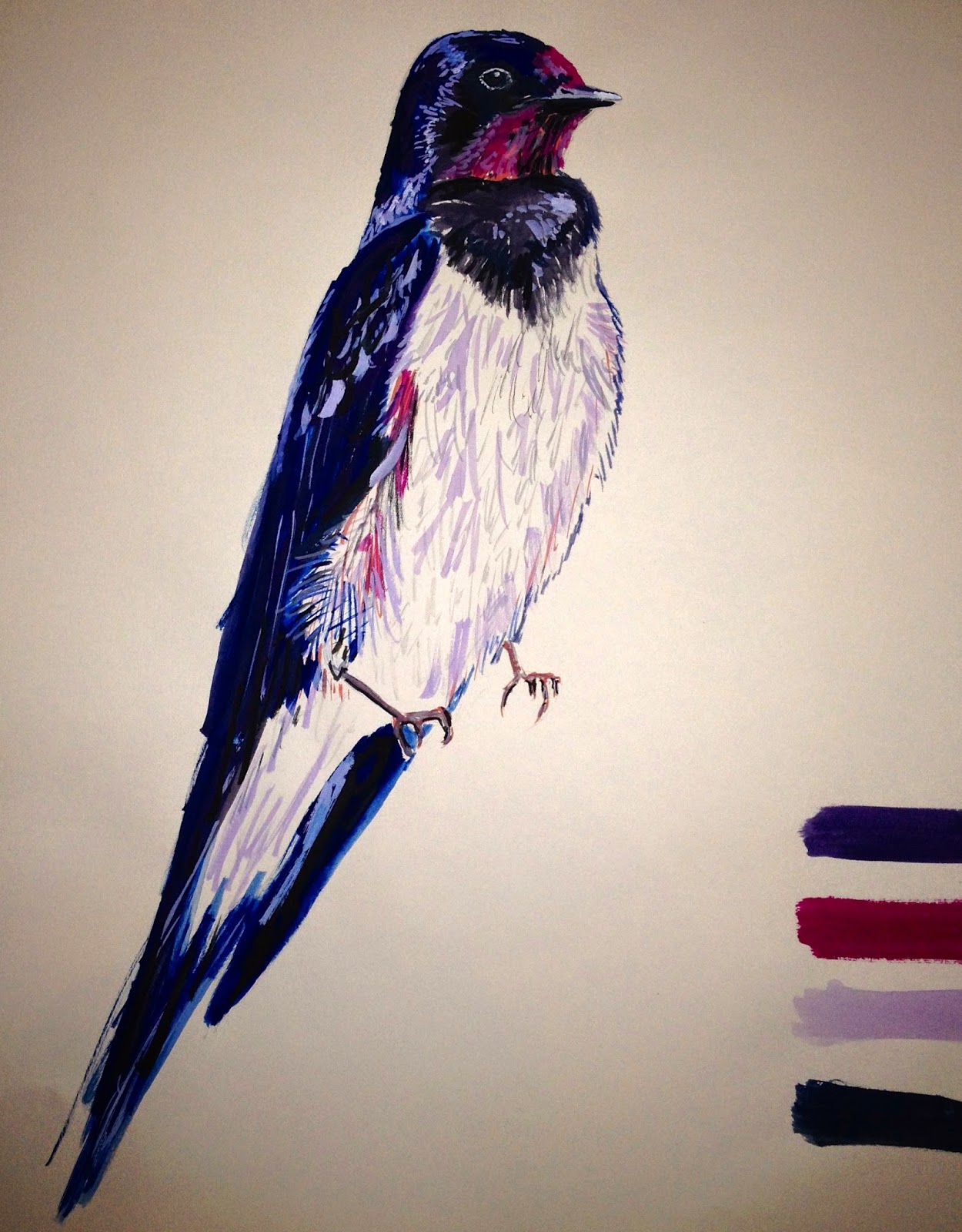
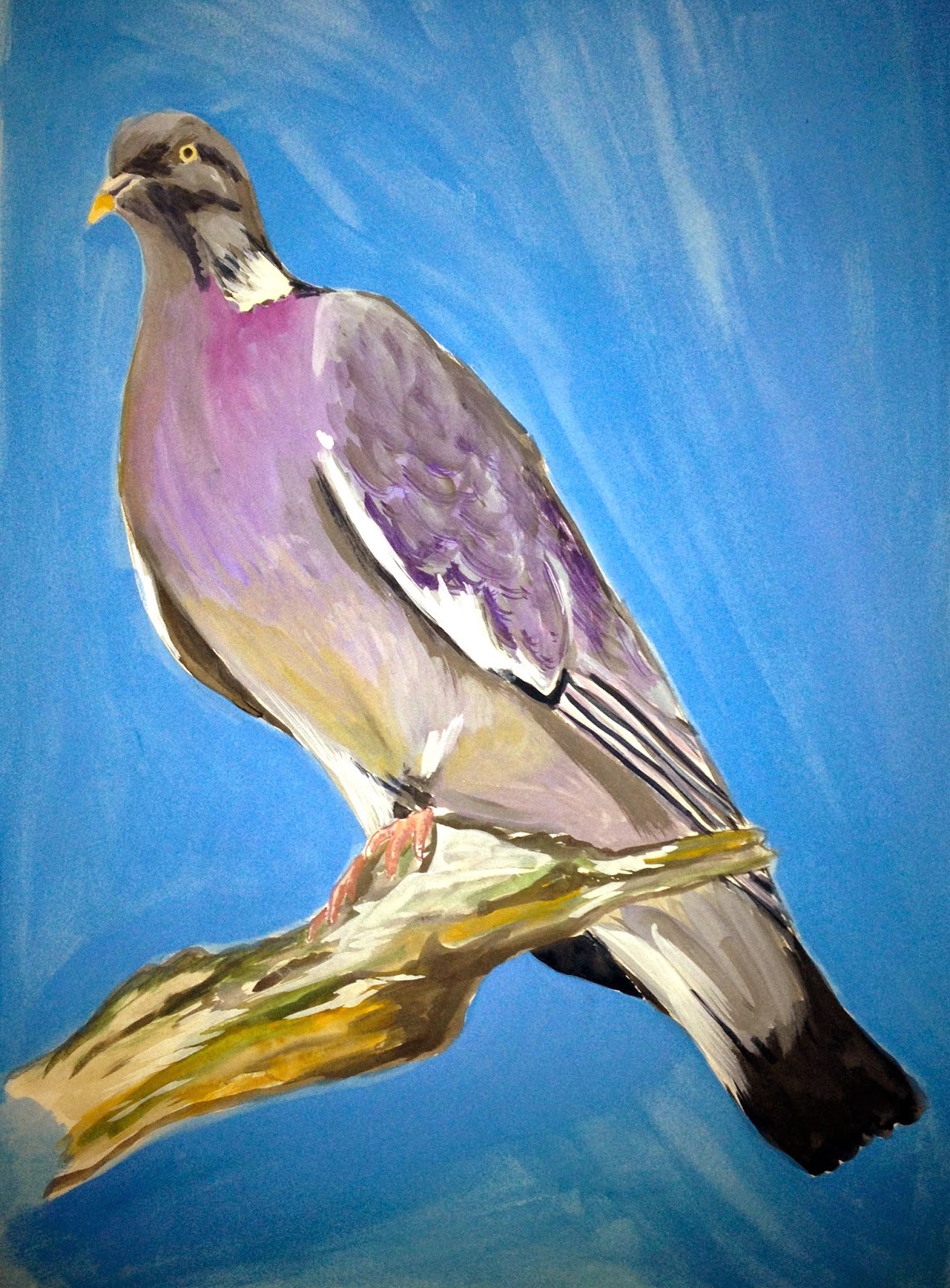
Here you can see how I have begun drawing British birds with watercolour pencils and gouash. I really like the thick quality to the gouash as it gives a really strong colour, however, I am also pleased with how the watercolour pencils allow detail and can be blended for various tone. I believe the drawings with a coloured background gives a bolder appearance and I have also started to think about pattern by repeating birds near one another with branch-like lines and patterns which I have created from looking at the birds feathers.


Monday, 5 May 2014

lino prints + photoshop


These are my favourite designs for scarves where I have incorporated lino cuttings with photoshop-editing to achieve brightly coloured prints which subtly show the anatomical theme in a light-hearted and more commercial way which I find more appealing to a wider audience.

anatomic scarf designs


Here I have scanned plastic faux bones and edited using photoshop to create colourful designs for a scarf context. I really like the colour palettes of these ideas and believe they would be successful as digital prints on a silk satin. I have also added my own drawings to add some extra interest with pattern and line.


Friday, 18 April 2014

Anatomical "muscle" photographs

These images are simply photographs of meat which I have edited on photoshop. Although the theme is slightly gruesome, and not something that you would imagine as being appealing or suited on fashion garments, I feel that when the colours are edited so they appear less "bloody" they have a peaceful, futuristic and marbled look which is quite intriguing.


I have also mirror-repeated one image because it gives a symmetrical appearance which makes it feel modern and would suit a scarf context.